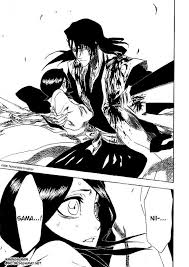
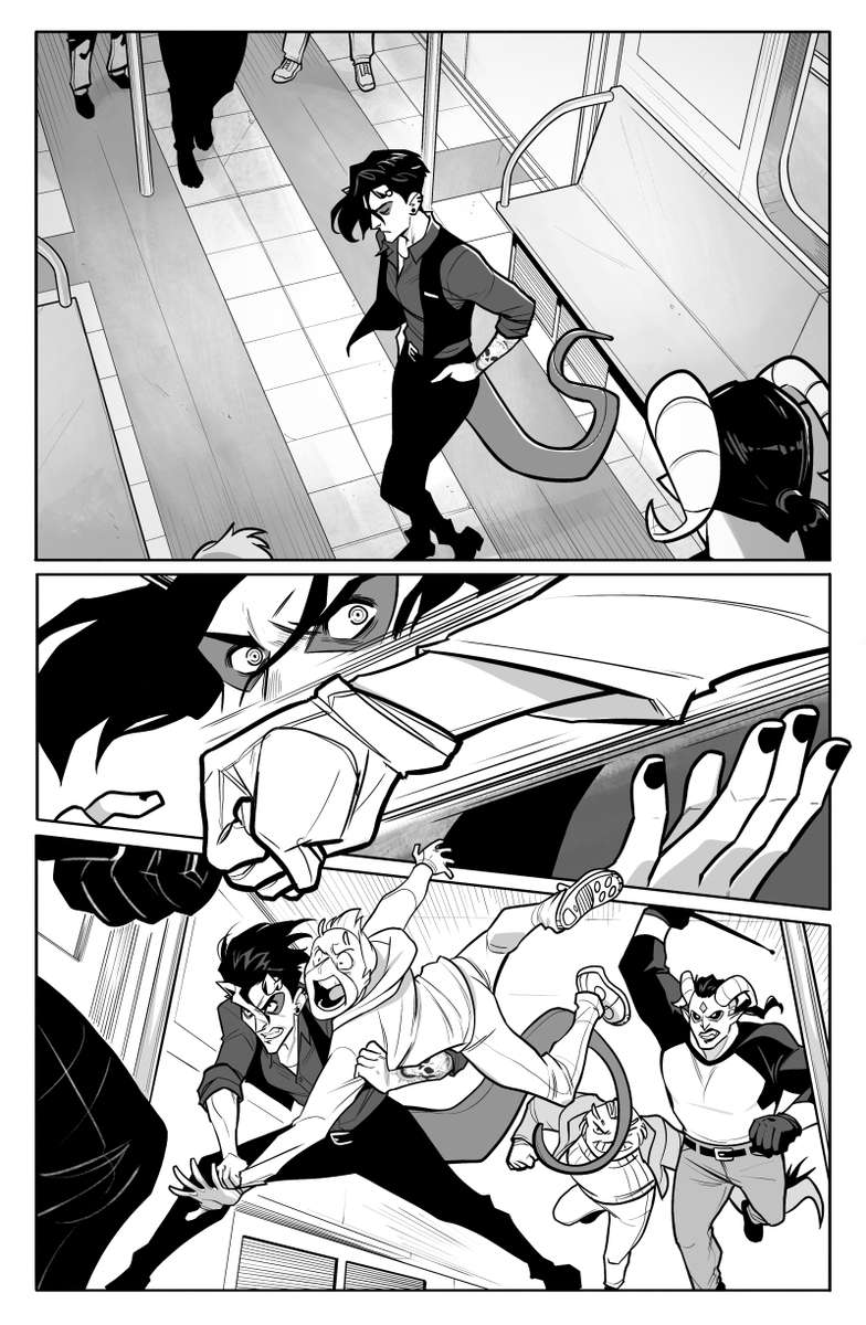
Secondly, working in black and white forces you to focus on paneling, inking, contrast and negative space. The color white is NOT YOUR ENEMY. Exploit that negative space and contract for dramatic effect. (Art from Bleach and Speak the Devil by @MLeeLunsford)
Thirdly, boy is black and white cheap to print? So cheap! Cheap cheap cheaaaap! While looking amazing. And because it's cheaper, you can invest cash into making that cover art INSANE.
I haven't even mentioning screentone texturing yet? And how clip studio is awesome for black and white stuff? Give in. Try it.
Also bonus doodles, for anybody wondering about the anchor placements. I would have drawn me and @savvyliterate in AATN, but @mishacak3s beat us to it we appear as librarian cameos in book 1. (3/3)