I was on vacation for most of episode 2 but here are some fun ones! Filling out the wanted posters on the show has been an ongoing delight.

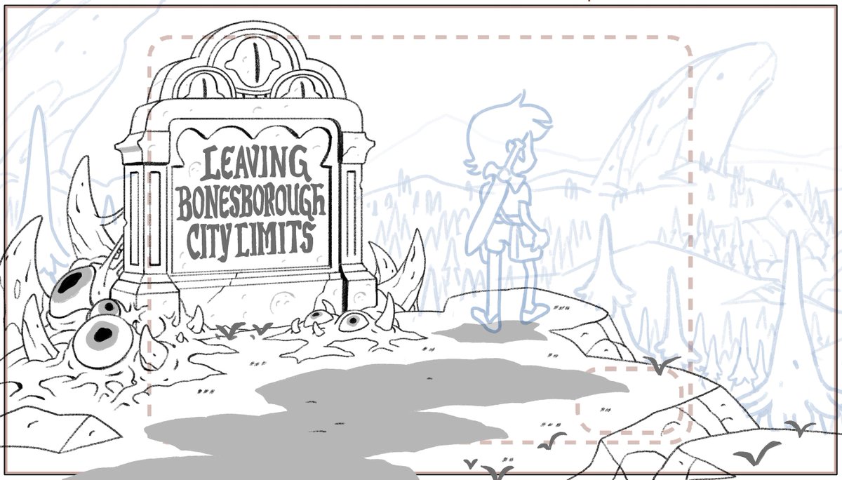
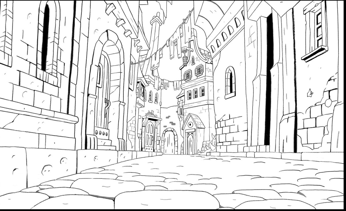
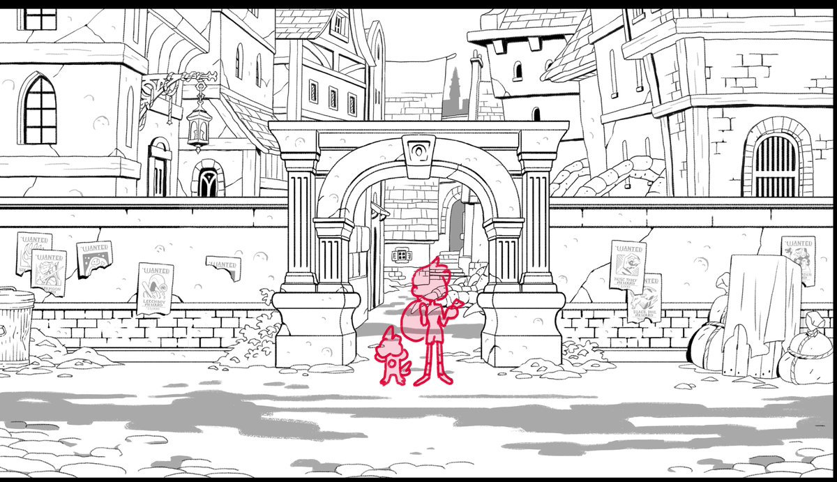
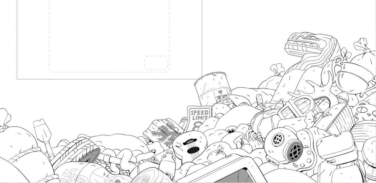
I have no memory of drawing these trash heaps, but Hexside was one of my first real landmark locations I got to do.


Ok, episode 4 -- last one for now. Had some S&P notes of these, ha ha. The ones that are unfinished are partial line -- the rest of the design is referenced from an existing background and will be drawn by the animation studio.
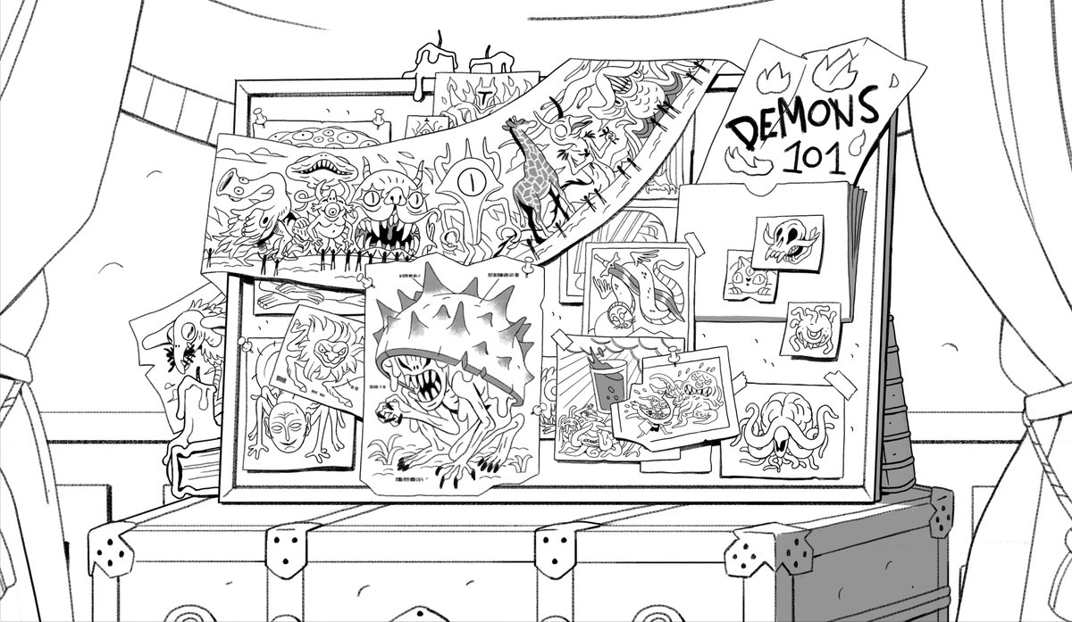
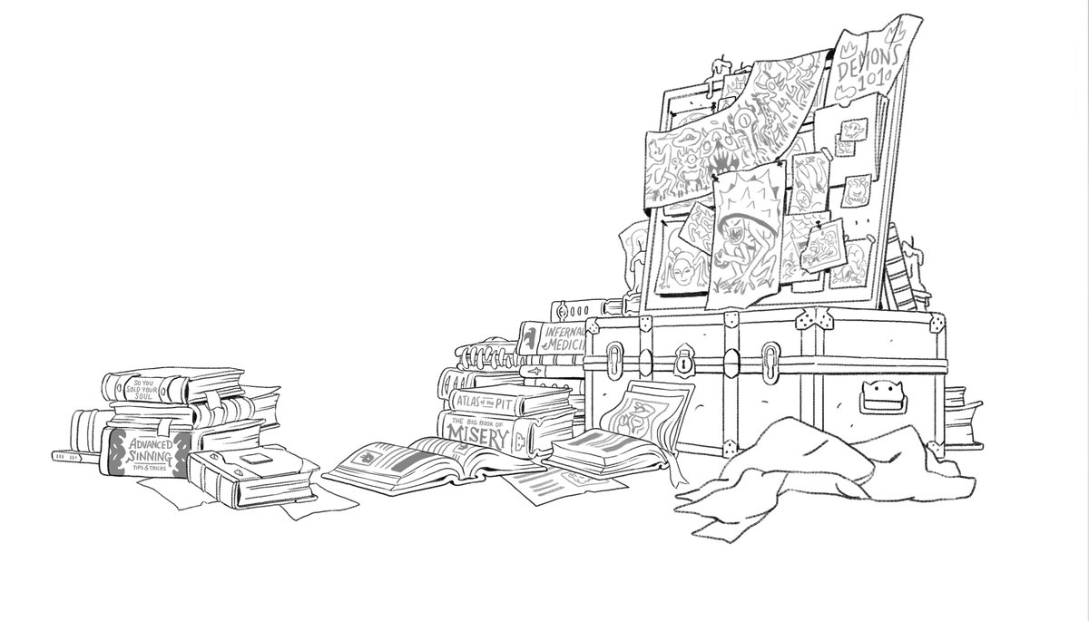


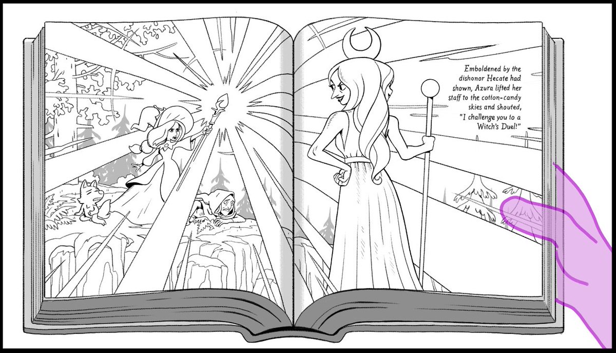
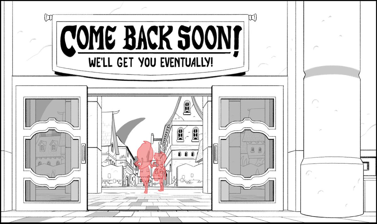
Episode 5! Kind of a tough one since the Covention Hall is much more of a real world location and we had to figure out how to combine that with our existing Bonesborough architectural style. I really love figuring out the type for signs. Plus -- I got to draw this cool book!

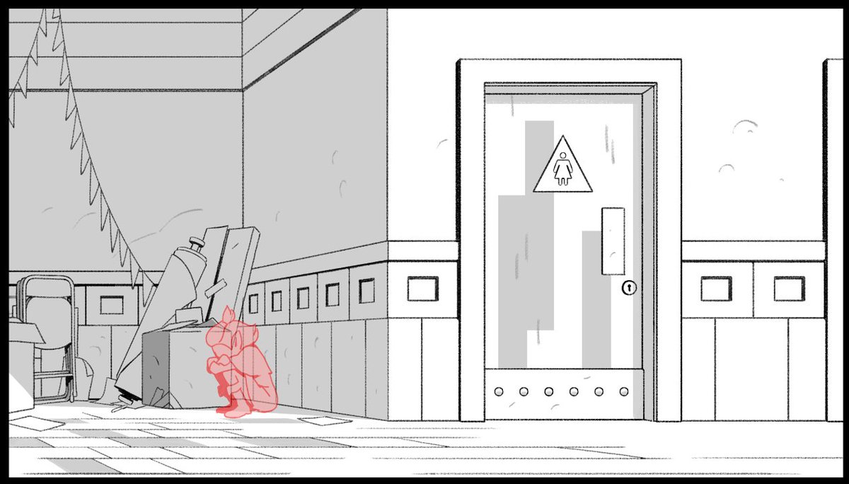
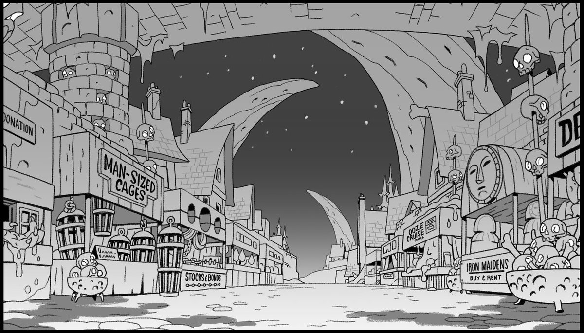
Episode 6 has one of my favorite locations -- The Night Market! So glad they let me figure out the shop names and designs by myself -- it means I have opportunities to put in background jokes that otherwise I wouldn't have!


作者のその他の人気の漫画

Owl House season 2 has begun airing!! Here are a selection of my bgs from the episode Separate Tides.

Honestly, lol, should probably just tweet this one on its own for how much of an effort it was. The skeleton in the board was much more of a fishy creature, but I ended up redesigning it for Lore Reasons.

A few backgrounds from Clouds on the Horizon! One of my favorite Bonesborough shots in here, plus some general expansion of existing locales. The CATS headquarters was done after previs by @stesug! You can see that the rose over the door was changed for LORE REASONS

Annnnnnd 206: HUNTING PALISMEN, featuring Latissa, my favorite location so far. Very proud of these, and especially because this was the episode where we finally grossed Dana out too much and had to rein it back.

Gonna make a thread of some of my background layouts from The Owl House and update it throughout the season. Here's a few from episode one. Yes there are Easter eggs.

Episode 202! Fun interior stuff in Blight Manor, mostly working over really nice pre-vis work from @SteSug

Here's a few quick n dirty examples of how I've used this on black and white work in the past. These are from @zacgormania's book "Thisby Thestoop and the Black Mountain." Verrrrry basic application, usually yields good results.

These are the digital mockups (and initial thumbnails) for my Line Weight pieces - you can see I stuck pretty close to them in the finals.


