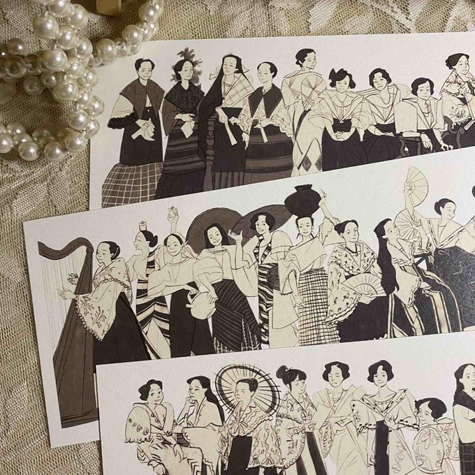
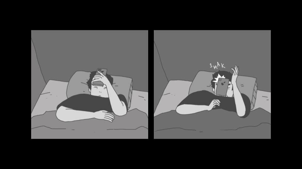
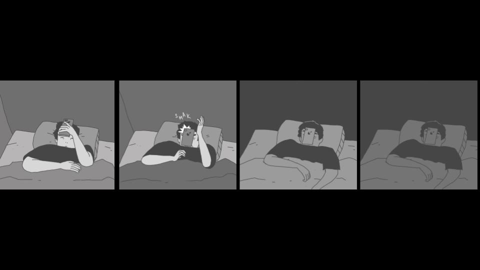
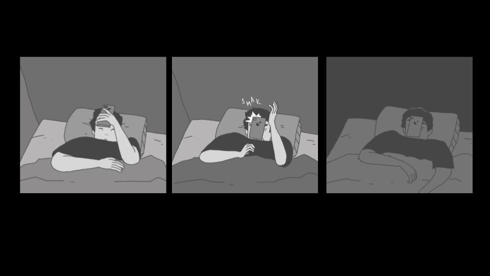
to me good panelling is invisible but there are so many ways for panelling to enhance your'e storytelling examples the set-up punchlines of a 3 panel strip how a strict 4 panel grid sets up a rhythmn/balance how more panels feels like more time
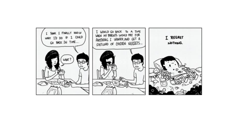
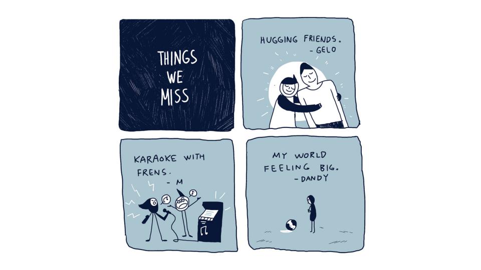
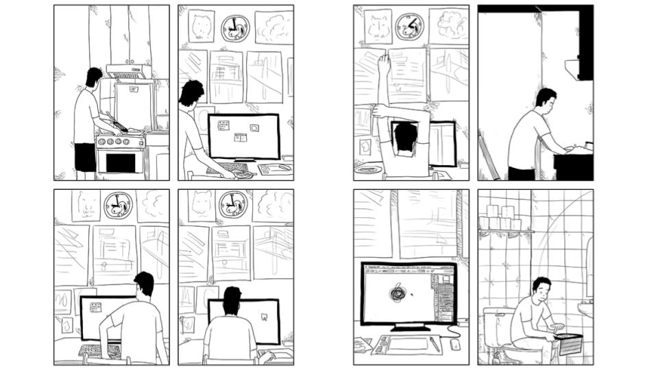

panelling for me is also reflective of style my favorite comic creators, Jason, strictly adheres to panel grids whether 4,6,8, or 9 panel grids his dedication to this oftentimes allows his style swerves where the significant moment/panel is given the same weight as the mundane
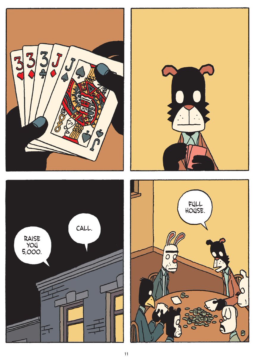
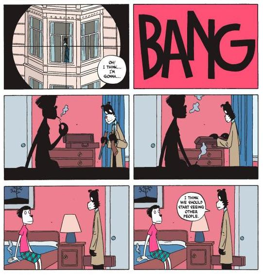

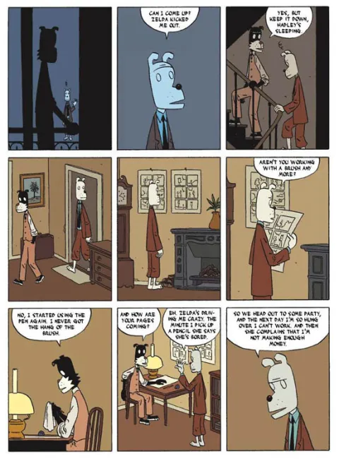
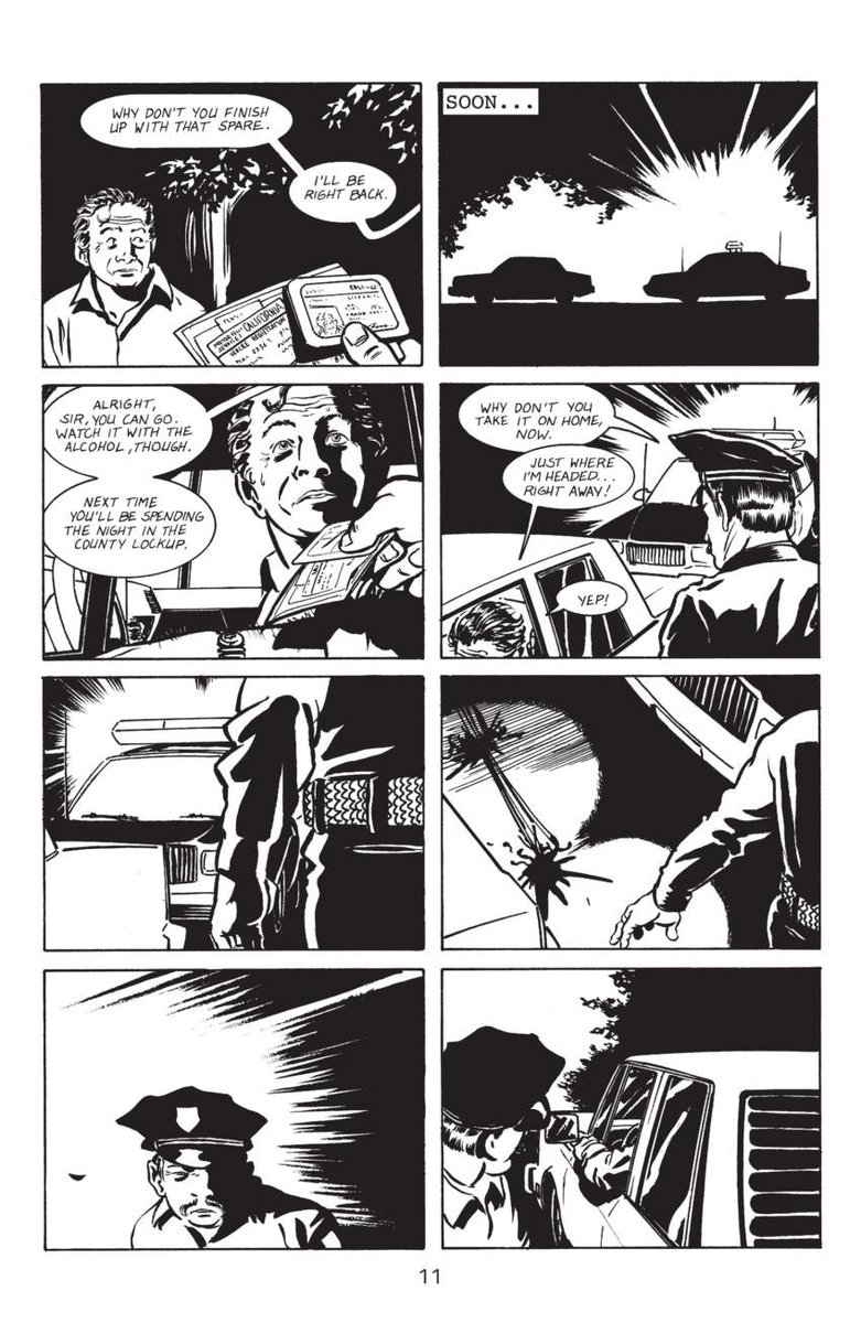
A grid isn't neccesarily boring in my opinion, it's a good tool for people starting out as it allows comic creators to focus on learning on 'picking the moment' per panel allows for that when you choose to break the grid, it's impactful (pages from Stray Bullets and Watchmen)
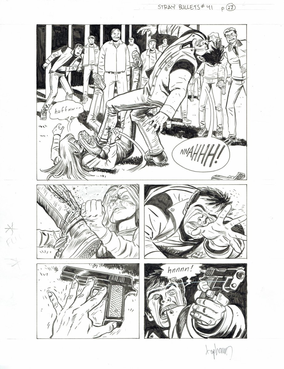
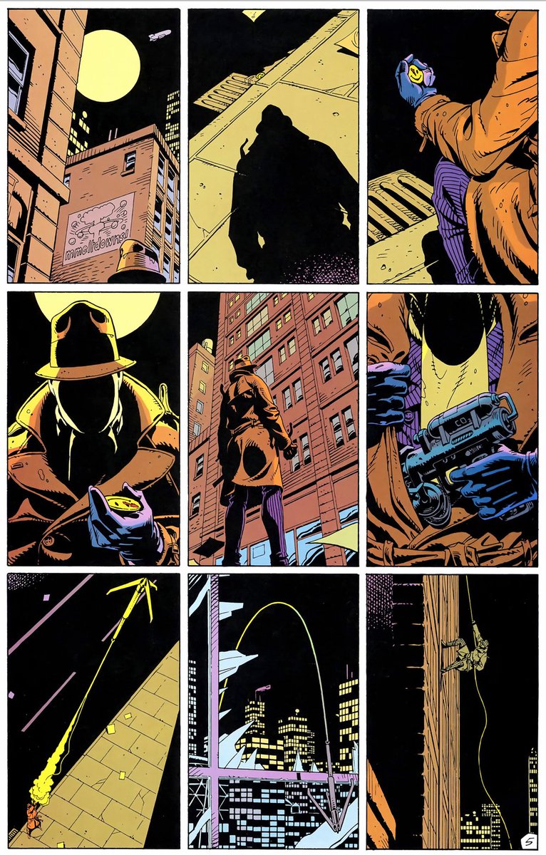
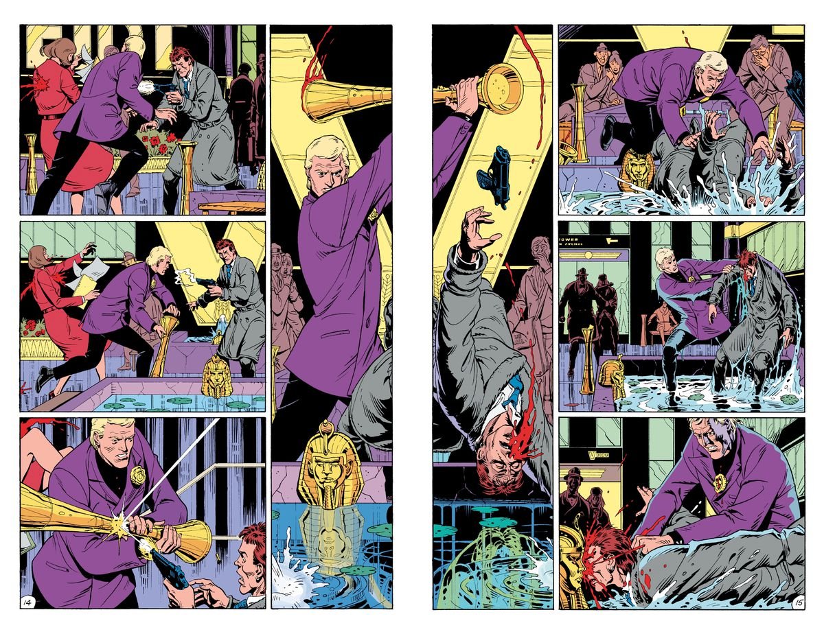
comics is sequential imagery, and is often storytelling through juxtaposition of images it isn't moving images, but static, you often have to pick the right moments to tell a story take for example a bouncing ball. how many panels does it take to show? how much time passes?
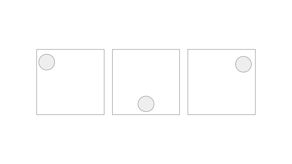


how much space do you give a moment? how do you arrange the moments? adding and subtracting panels/moments often changes how a story is told, and also changes the way your page is laid out comics panneling to me is one constant obsession

作者のその他の人気の漫画

artist alley breakdowns

fun facts from filipinos

words from fleabag. working on something. page 1/???

push a button

love is awful words from fleabag. art by me working through my issues about break ups and lost love

say im okay

when the drawing does not turn out like how you imagined it in your head

Sketch Final

