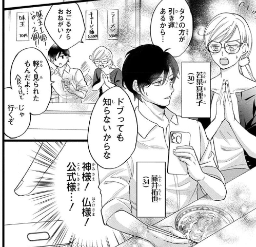
my layouts have become looser over time, but if they're clear enough I'll draw over them to make the finished product (though there are a lot of pages where I just have to draw everything from scratch since the layouts are way too rough lmao)


It's so annoying to see this sort of stuff overlooked in translated media when I know the JP side is incredibly detailed and picky about the same stuff. Lettering is so important that editors sit down a detail which fonts need to be used at what size for every line of text
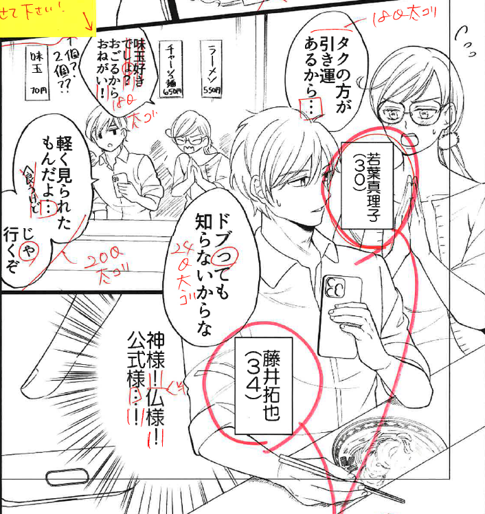
Compare the above with the finished product. It just looks better. Because they put the time into making it look that way. I get that it's not that apparent when you're doing this in another language, but that's why you get people who know what they're doing...
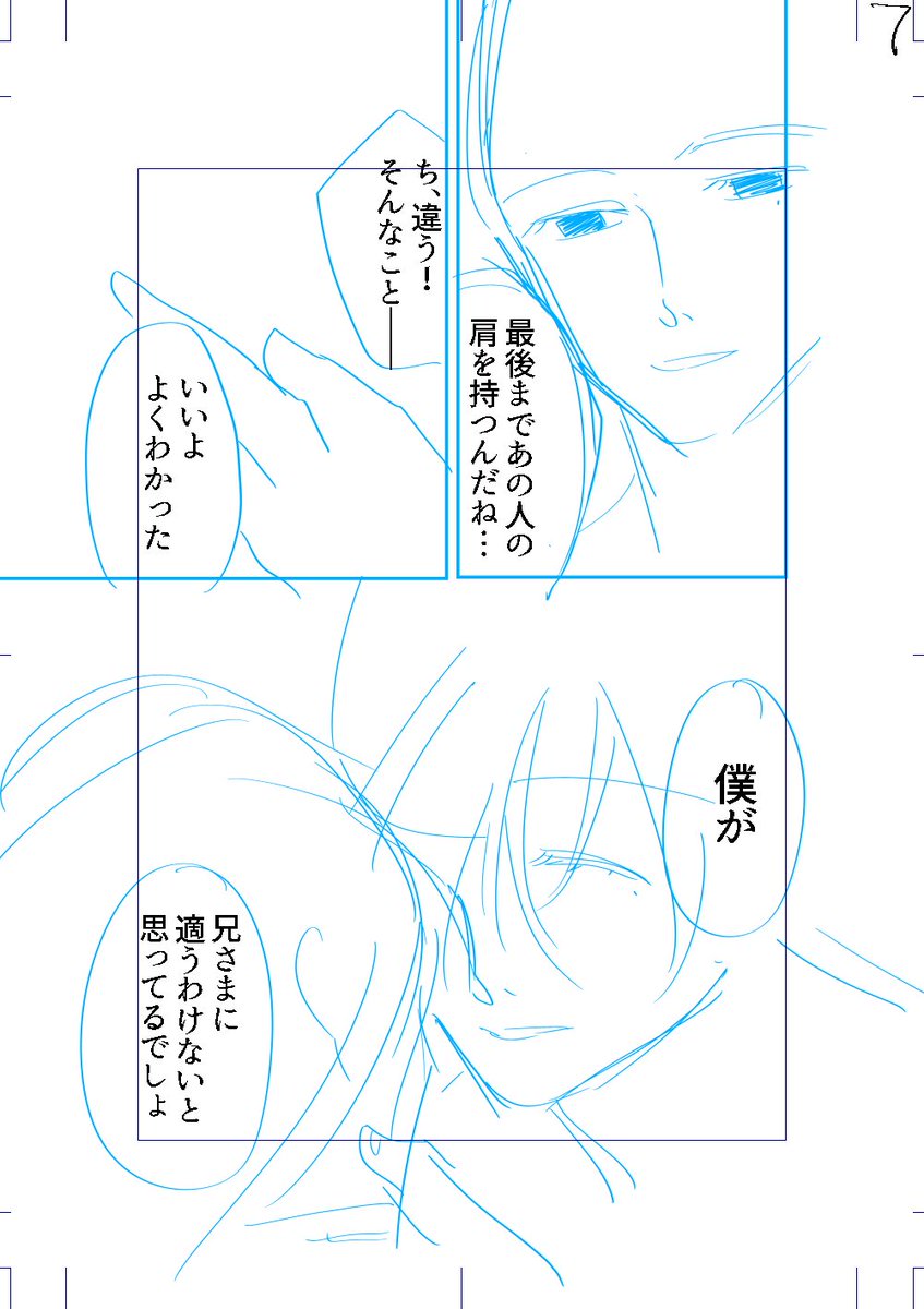
i've been rereading things from the beginning for various reasons, and I really do love this opening

作者のその他の人気の漫画

a story about a witch who cleans out her inventory and accidentally gives one of her clients a love potion (0/9)
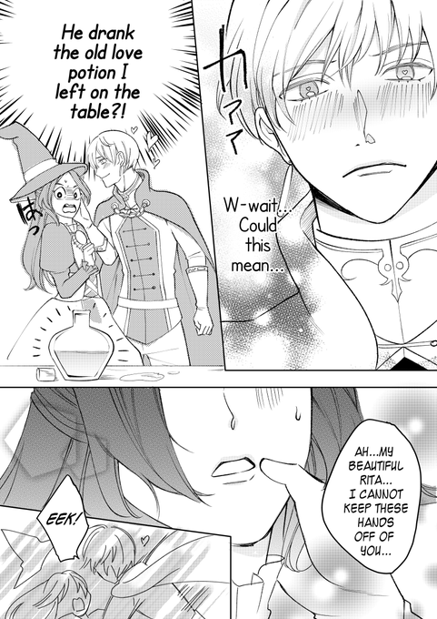
a story about a witch whose knightly client accidentally drinks an old love potion of hers (0/9)
when you end up falling for a gacha game addict (0/4)
when you get isekaied into your favorite game but your name is now your username (0/13)
when your gacha luck is so bad you get isekaied into the game of the chara you were pulling for (0/9)
When you meet your childhood friend again, but a lot more has changed than you realized (1/6)
when you're isekai'd into the wrong route (0/5)
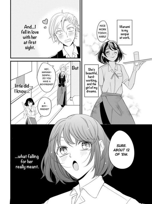
when you want senpai to notice you but she's too busy with her 12 boyfriends (1/5)
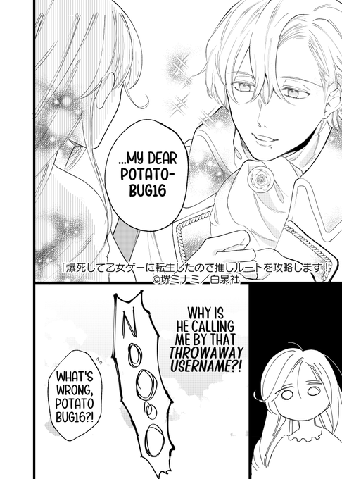
when you get isekaied into the wrong route of your favorite otome game (0/3)
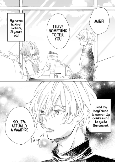
when you find out you're not your vampire boyfriend's type
Currently obsessed with this manga about an ex-villainess who was actually a boy raised as a girl and eventually gets banished to an island where he grows up to be a charming professor of archeology LOL
(9/9)