I like this look for backgrounds cause everything feels like it fits but I know I would be annoyed by lining the bg when I can just scuffle about with it instead. It's mostly me being impatient tbh. There's plenty of times where I've benefited greatly from lining the bg.


Pfft I remember this. There was so much drama, Sally was always in a love triangle between Sonic and someone else it never ended 🤣


If anyone asks about the inspiration for my lion style, it's inspired by the works of Bernard Willem Wierink, Ferdinand Henri Oger, and Claire Wendling.


作者のその他の人気の漫画

A quickie warmup

Drawin' some bug people

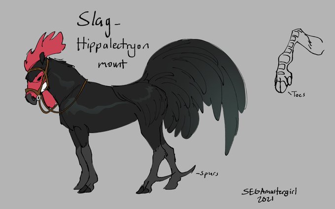
Here's a clearer example of the anatomy.

In our Pixar/ X in the box we had to create what if scenarios for our stories. Went with the first choice clearly but I'd still like to explore these others ones at a later date.

*Appreciating the placement of Bambi's spots from an animation standpoint.*

I love animal shifter designs that incorporate the human hair in a natural way.

Oh this is really interesting. Blending taxidermy and funerary practices and its legal gray area.

A messy test I did of Tsunami in storyboard pro.


