I hope studio orange's work on Trigun Stampede gives over to Beastars s3. Specifically with expressions because while they're already great, I've greatly missed Haru's more exaggerated expressions from the manga.

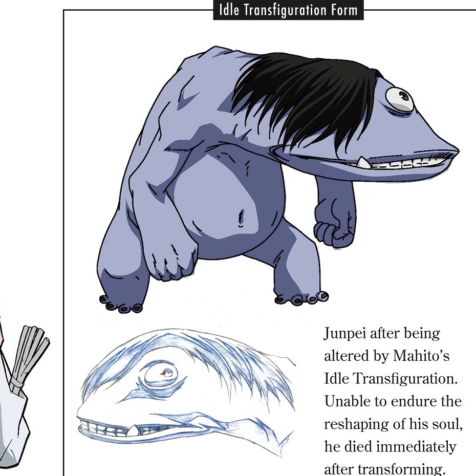
Jjk spoilers if you haven't seen it but I so so hate that I'm cursed with the knowledge that the reason why Mahito made Junpei look like that(tm) is because he likes Perry the Platypus. Like, what am I supposed to do with this information?! Cry again???

Consider: Tangents in art isn't always bad, it's how you use them. Cartoon Saloon is my favorite example of using tangents to make shapely and interesting designs.


作者のその他の人気の漫画

A quickie warmup

Drawin' some bug people

Here's a clearer example of the anatomy.

In our Pixar/ X in the box we had to create what if scenarios for our stories. Went with the first choice clearly but I'd still like to explore these others ones at a later date.

*Appreciating the placement of Bambi's spots from an animation standpoint.*

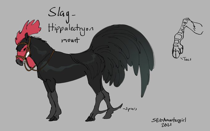
I love animal shifter designs that incorporate the human hair in a natural way.

Oh this is really interesting. Blending taxidermy and funerary practices and its legal gray area.

A messy test I did of Tsunami in storyboard pro.


