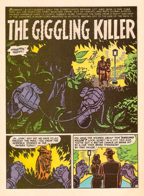
Jack Cole used Panel borders as story devices like no one else before or since


I'm always impressed by Toth/Sickles/Caniff's creation of depth in their work, and after binge watching films from 30s and 40s I can see that influence. Study the classics kids!


Been looking at Kubert & Kirby War Comics all day and it's @alexdecampi fault


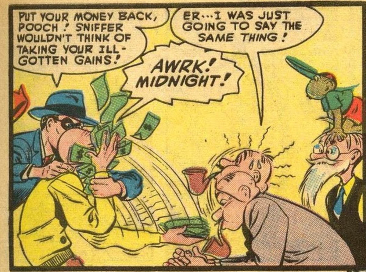
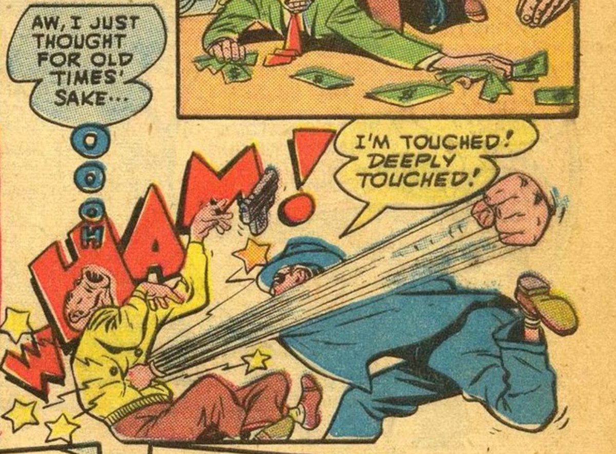
Cole drew cartoon violence better than anyone! Dig the "stop hitting yourself" move and the secondary action of hitting the other guy too in panel 1. Then on the same page- the fist floating untethered and slamming in for the punch. Comics version of the animation smear.


作者のその他の人気の漫画

Take a Toppi Break with me won't you? Master of texture, design, use of negative space and scale.

Today's inspiration Rodolfo Damaggio's Captain America Storyboards

Some Rodolfo Damaggio to end your week right

As comics get more "widescreen" I've really come to appreciate the sweet, skinny, vertical panels of Miller's DD

we do not spend enough time gushing over how great John Bogdanove is. Great Cartooning skills, amazing draftsmanship and gestures. From a new mutants annual and X-terminators

Kurtzman. I want comics to be colored like this again

Urasawa's celebrity portraits are the best

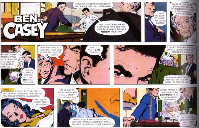
my favorite Neal Adams stuff was his comic strip work...what a legend


