Breaking down how Spiegel uses negative space in between figures (panel 2) and creates depth with overlap (panel 1) the war panel 1 is colored really adds to the depth but the level is detail is what sets it up...patterns are helpful too


Gil Kane on Kurtzman's war comic : "People just didn't die, but human beings died in human and affecting terms" One of my favorites from two-fisted tales


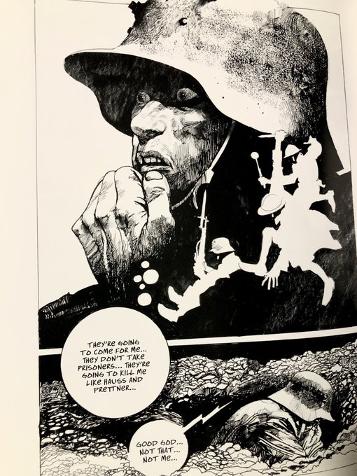
The amount of variety and the level of draftsmanship in this one issue of Crossfire is ridiculous...Spiegel was a beast


Love how Caniff just slaps the ink down in the shadows and folds. Like an abstract painter


作者のその他の人気の漫画

Take a Toppi Break with me won't you? Master of texture, design, use of negative space and scale.
Today's inspiration Rodolfo Damaggio's Captain America Storyboards
Some Rodolfo Damaggio to end your week right
As comics get more "widescreen" I've really come to appreciate the sweet, skinny, vertical panels of Miller's DD
we do not spend enough time gushing over how great John Bogdanove is. Great Cartooning skills, amazing draftsmanship and gestures. From a new mutants annual and X-terminators
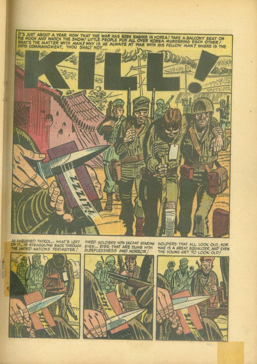
Kurtzman. I want comics to be colored like this again
Urasawa's celebrity portraits are the best
my favorite Neal Adams stuff was his comic strip work...what a legend
Toth famously said " Strip it down to the essentials and Draw the hell out of what's left". Calling something "simple" because of a lack of (over)rendering implies that less lines = less work. Here's Toth keeping it Simple
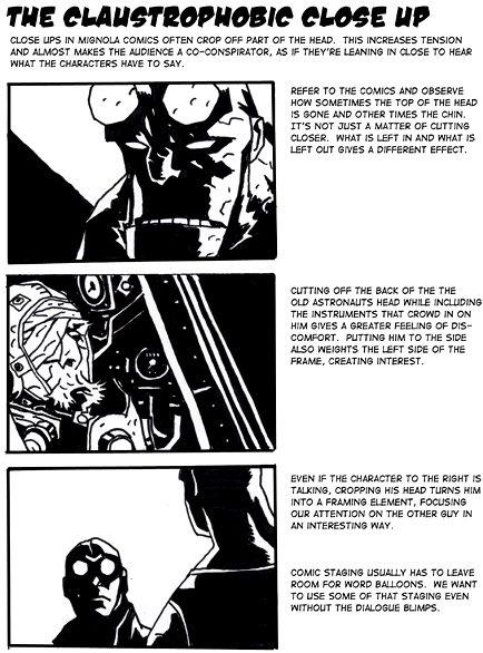
Little Breakdowns of the "hellboy style" made by @TadStones for the Hellboy animated shows to capture the @artofmmignola magic. So great https://t.co/wiUceHtiKC
Let's spend Monday gushing over Barry Windsor-Smith, shall we? This is the closest we will get to seeing how Michelangelo would've drawn comics. Classic draftsmanship and beautiful storytelling
Eisner