

Mike designs the hell out of his pages...his use of white space is as powerful as his use of black. I need to get caught up on my powers collection!


Reading God Loves, Man Kills and wondering what Oliff used to color? Was this Dr Martens ink? Man I'd love to color like this (or draw like Andereson)

One the biggest lessons I take away from @AdamKubert is how to use a variety of scale for narrative and design purposes. Very few people have the draftsmanship chops to pull these types of pages off.


He also stages his panels for maximum story effect-there are no "standard" shots. Also makes great use of "depth of field"


作者のその他の人気の漫画

Take a Toppi Break with me won't you? Master of texture, design, use of negative space and scale.
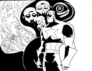
Today's inspiration Rodolfo Damaggio's Captain America Storyboards
Some Rodolfo Damaggio to end your week right
As comics get more "widescreen" I've really come to appreciate the sweet, skinny, vertical panels of Miller's DD
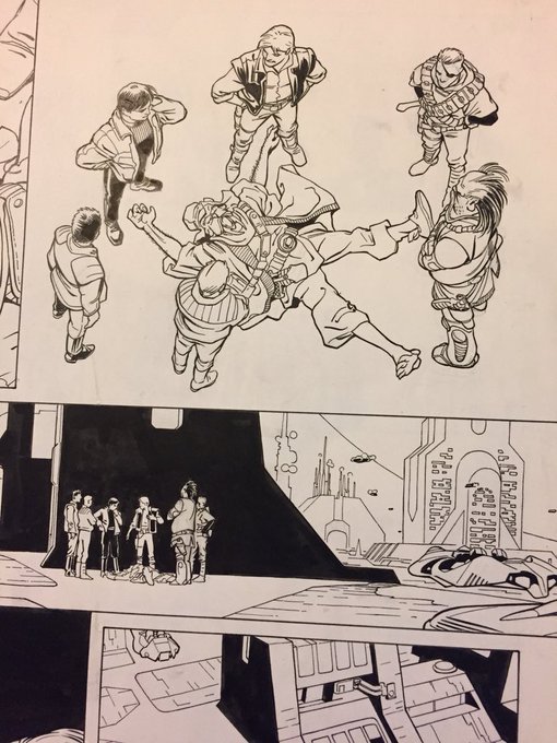
we do not spend enough time gushing over how great John Bogdanove is. Great Cartooning skills, amazing draftsmanship and gestures. From a new mutants annual and X-terminators
Kurtzman. I want comics to be colored like this again
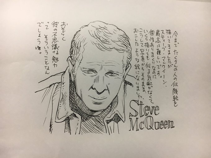
Urasawa's celebrity portraits are the best
my favorite Neal Adams stuff was his comic strip work...what a legend
Toth famously said " Strip it down to the essentials and Draw the hell out of what's left". Calling something "simple" because of a lack of (over)rendering implies that less lines = less work. Here's Toth keeping it Simple
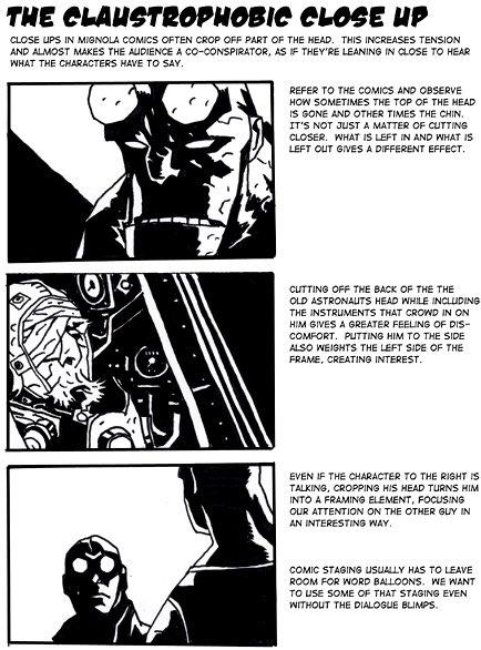
Little Breakdowns of the "hellboy style" made by @TadStones for the Hellboy animated shows to capture the @artofmmignola magic. So great https://t.co/wiUceHtiKC
Let's spend Monday gushing over Barry Windsor-Smith, shall we? This is the closest we will get to seeing how Michelangelo would've drawn comics. Classic draftsmanship and beautiful storytelling
Eisner