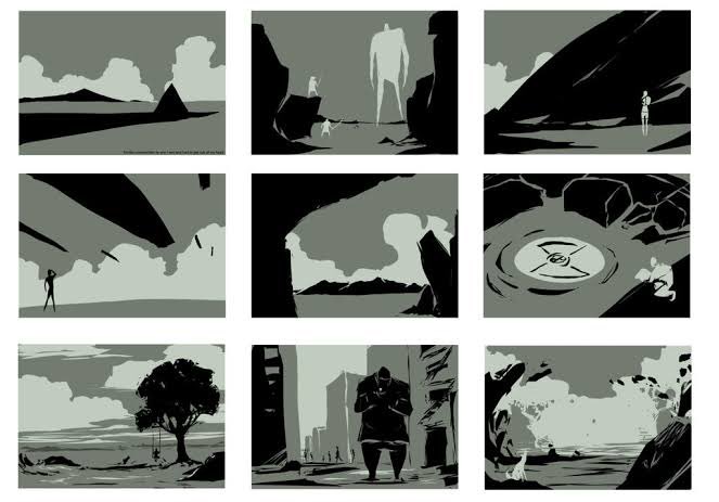
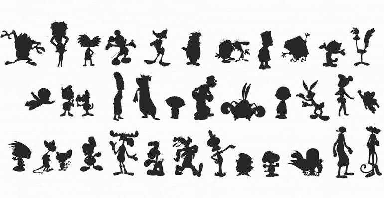
learned this in my animation class. compositing is easier if you lay them all out in grayscale. it all applies in design! (logo, graphic design, type, character, etc.) (photos from pinterest)


作者のその他の人気の漫画

init 🥵 -ink on paper

Walang pinag-iba #NeverAgain #OustDuterteNOW

Pahabol posting #artvsartist2021 Not much personal art this year. Will try again next year 🥲.

lazy artist confession: drafted this series since june ?

Last month when I sketched this character study and it almost looked like Evelynn's styling in More MV. Gahd I love this devilish-typa hair.

learned this in my animation class. compositing is easier if you lay them all out in grayscale. it all applies in design! (logo, graphic design, type, character, etc.) (photos from pinterest)

Sketch vs. Inspo (me and my friends last January) Played around the direction of photos as how we keep lasting memories and relationships, esp now that we're not allowed to physically celebrate special occassions. #artph


![ano covid? suntukan na lang?!
us2 q na makita lods q lfjdhskahs
[based sa art style ni Tarantadong Kalbo]
#artph https://t.co/iPu4vMABnX](https://pbs.twimg.com/media/E8WpBSVUUAAhNza.jpg:small)