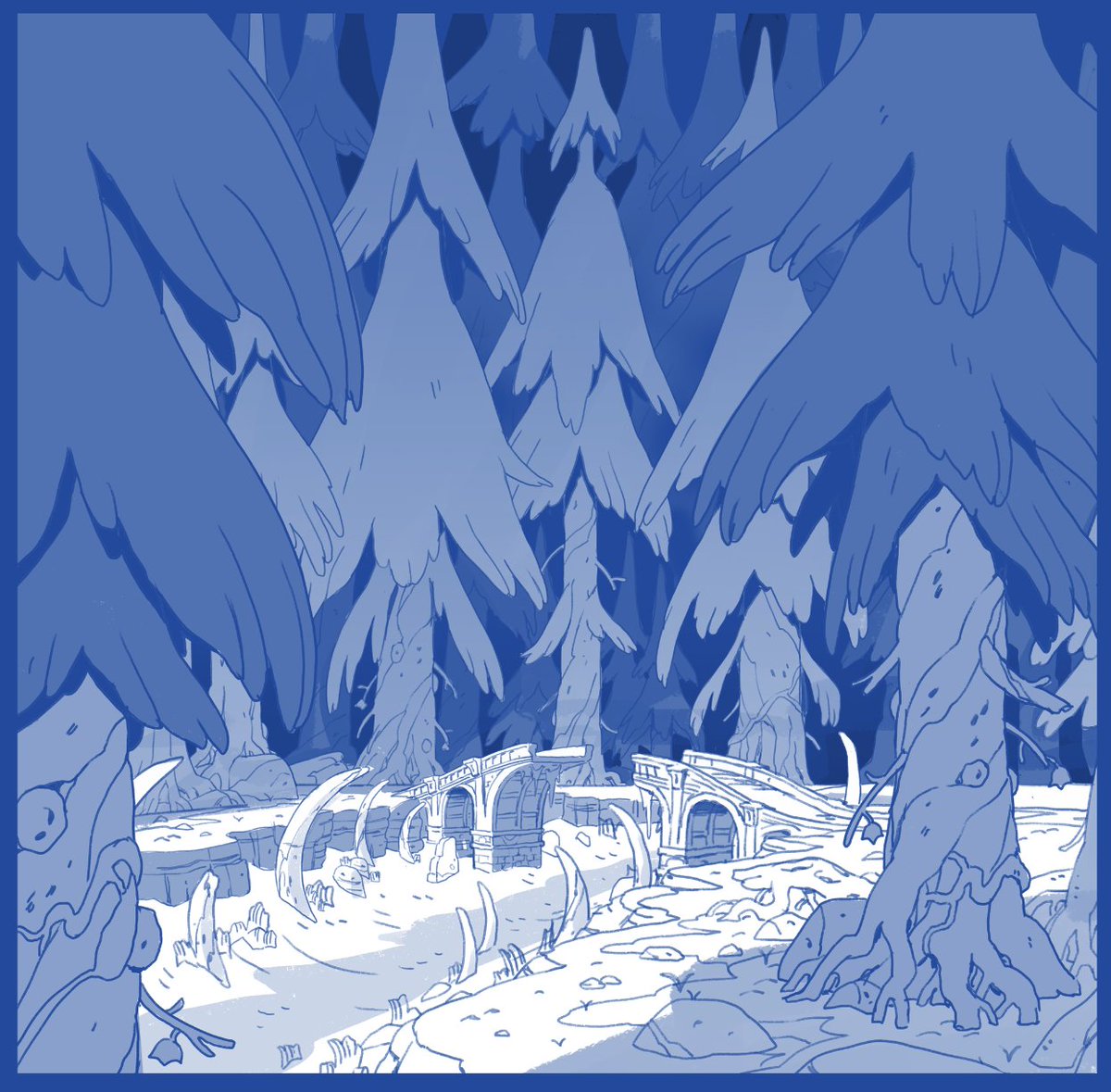
Back with more Owl House bgs! 207: Eda's Requiem. Spooky forest time! Not much to say here other than I've really liked figuring out different iterations of the Boiling Isles trees and this place was no exception.


Skipping ahead to the episode that just aired...217: Edge of the World. I will call this one a Difficult Episode, but I'm pretty happy with how these turned out. Tough to say what my favorite bgs I've done for the show are, but these are up there.


Honestly, lol, should probably just tweet this one on its own for how much of an effort it was. The skeleton in the board was much more of a fishy creature, but I ended up redesigning it for Lore Reasons.


A few backgrounds from Clouds on the Horizon! One of my favorite Bonesborough shots in here, plus some general expansion of existing locales. The CATS headquarters was done after previs by @stesug! You can see that the rose over the door was changed for LORE REASONS


作者のその他の人気の漫画

Owl House season 2 has begun airing!! Here are a selection of my bgs from the episode Separate Tides.

Honestly, lol, should probably just tweet this one on its own for how much of an effort it was. The skeleton in the board was much more of a fishy creature, but I ended up redesigning it for Lore Reasons.

A few backgrounds from Clouds on the Horizon! One of my favorite Bonesborough shots in here, plus some general expansion of existing locales. The CATS headquarters was done after previs by @stesug! You can see that the rose over the door was changed for LORE REASONS

Annnnnnd 206: HUNTING PALISMEN, featuring Latissa, my favorite location so far. Very proud of these, and especially because this was the episode where we finally grossed Dana out too much and had to rein it back.

Gonna make a thread of some of my background layouts from The Owl House and update it throughout the season. Here's a few from episode one. Yes there are Easter eggs.

Episode 202! Fun interior stuff in Blight Manor, mostly working over really nice pre-vis work from @SteSug

Here's a few quick n dirty examples of how I've used this on black and white work in the past. These are from @zacgormania's book "Thisby Thestoop and the Black Mountain." Verrrrry basic application, usually yields good results.

These are the digital mockups (and initial thumbnails) for my Line Weight pieces - you can see I stuck pretty close to them in the finals.


