frog cham@robcham

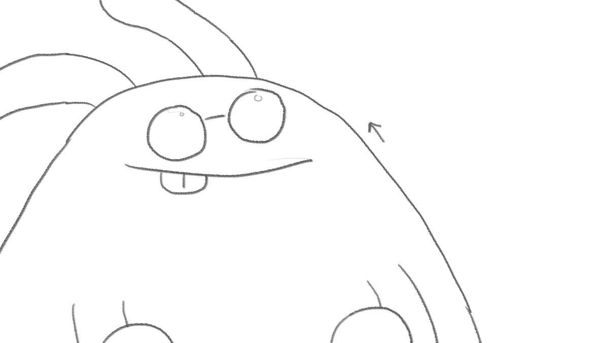
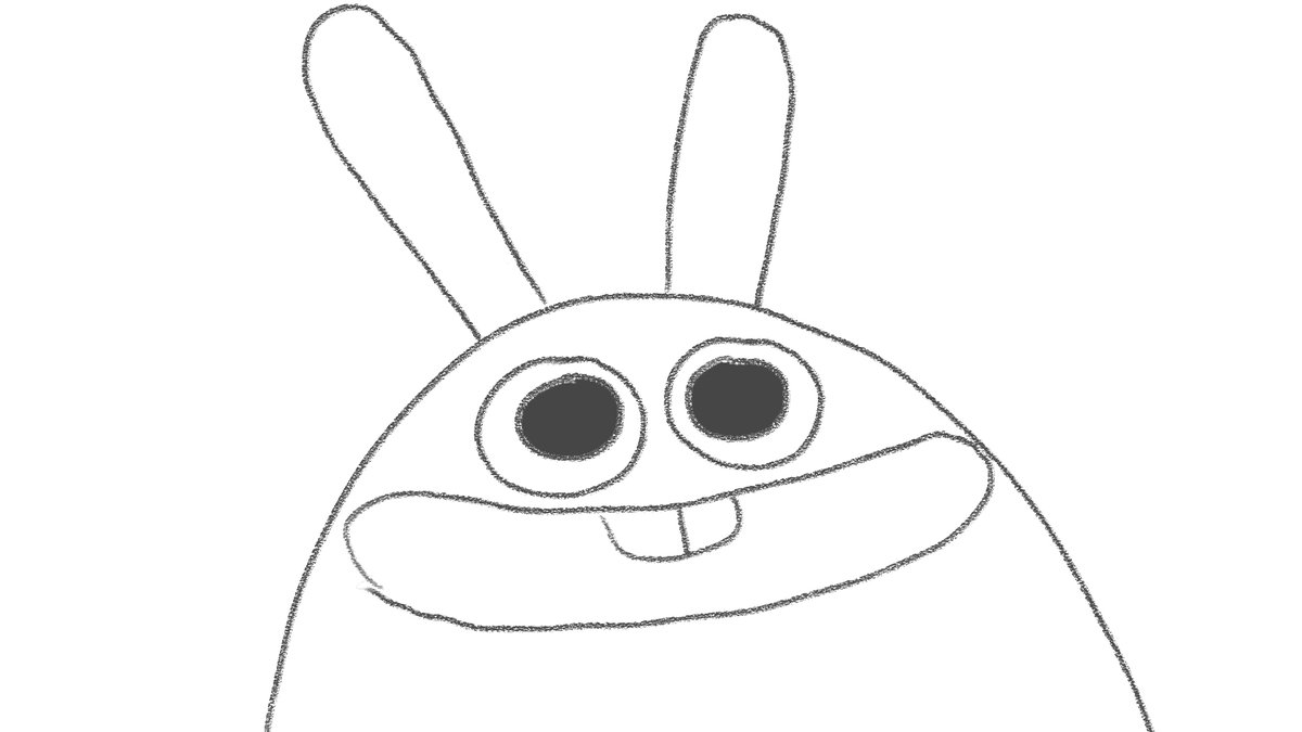
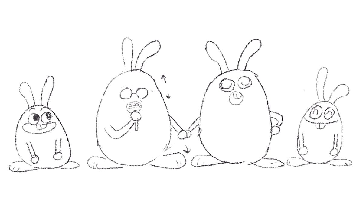
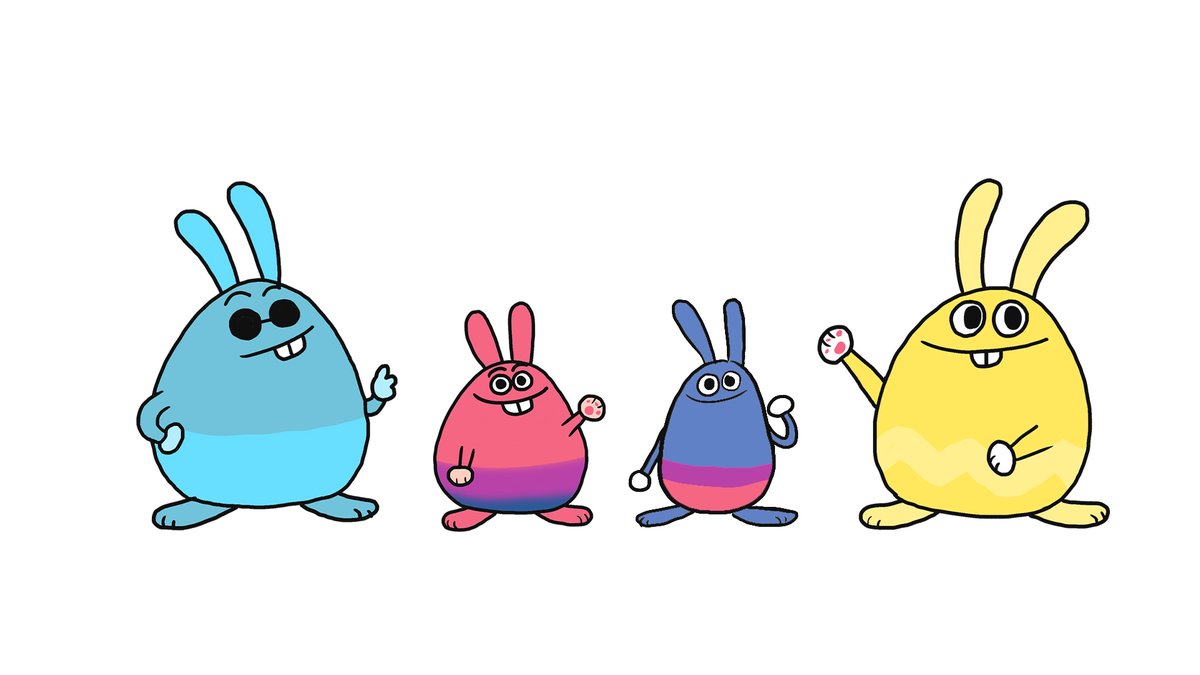
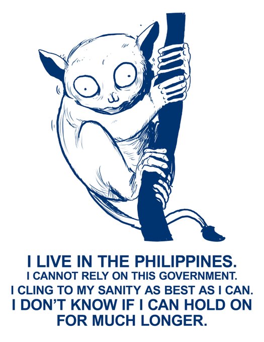
    some boards and concept art for Mommy and Papa have a show

    some boards and concept art for Mommy and Papa have a show
    some boards and concept art for Mommy and Papa have a show
    some boards and concept art for Mommy and Papa have a show
    some boards and concept art for Mommy and Papa have a show
    5613年前
    frog cham@robcham

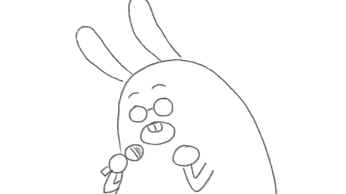
    i'm very proud that @KevinKalbo captured the majesty we were aiming for with this particular bit

    i'm very proud that @KevinKalbo captured the majesty we were aiming for with this particular bit

    i'm very proud that @KevinKalbo captured the majesty we were aiming for with this particular bit

    i'm very proud that @KevinKalbo captured the majesty we were aiming for with this particular bit
    i'm very proud that @KevinKalbo captured the majesty we were aiming for with this particular bit
    2333年前
    frog cham@robcham

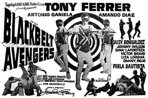
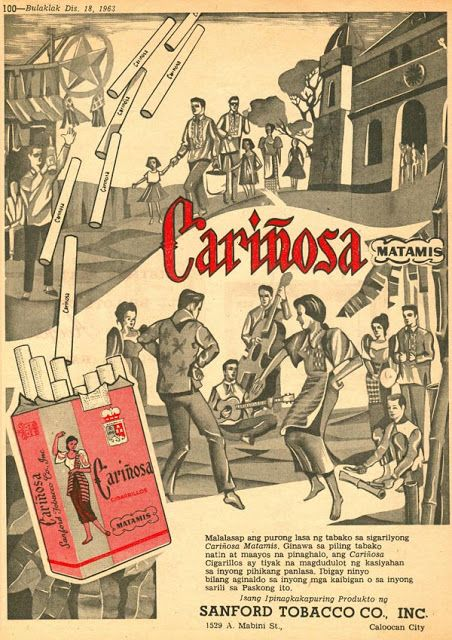
    we kinda imagined what if we approched it like old movie posters and ads and komiks to highlight that nostalgia you get from the song, and kinda tried to imagine it as 'what if the music video got its own movie poster treatment'
    we kinda imagined what if we approched it like old movie posters and ads and komiks to highlight that nostalgia you get from the song, and kinda tried to imagine it as 'what if the music video got its own movie poster treatment'
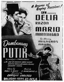
    we kinda imagined what if we approched it like old movie posters and ads and komiks to highlight that nostalgia you get from the song, and kinda tried to imagine it as 'what if the music video got its own movie poster treatment'
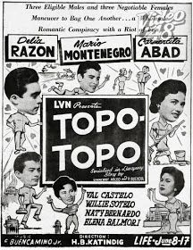
    we kinda imagined what if we approched it like old movie posters and ads and komiks to highlight that nostalgia you get from the song, and kinda tried to imagine it as 'what if the music video got its own movie poster treatment'
    we kinda imagined what if we approched it like old movie posters and ads and komiks to highlight that nostalgia you get from the song, and kinda tried to imagine it as 'what if the music video got its own movie poster treatment'
    0213年前
    frog cham@robcham

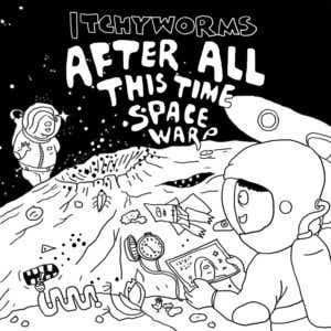
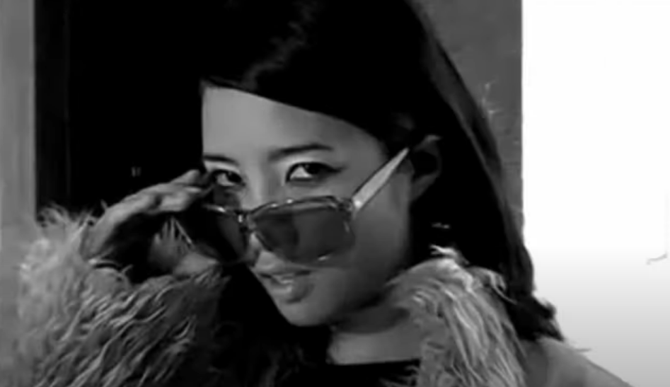
    idea i had for this was to show diff iconography thru the years of the worms, a bunch of easter eggs from their albums and music videos and kind of tried to make it a tribute to their legacy thru the years
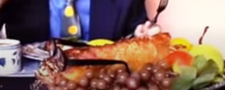
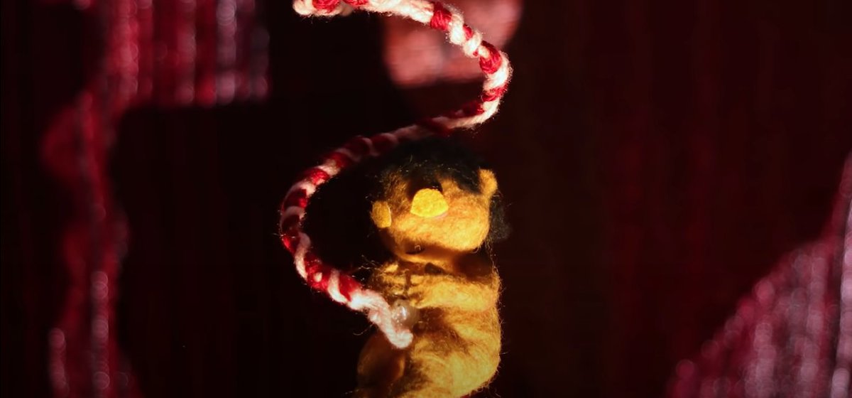
    idea i had for this was to show diff iconography thru the years of the worms, a bunch of easter eggs from their albums and music videos and kind of tried to make it a tribute to their legacy thru the years
    idea i had for this was to show diff iconography thru the years of the worms, a bunch of easter eggs from their albums and music videos and kind of tried to make it a tribute to their legacy thru the years
    idea i had for this was to show diff iconography thru the years of the worms, a bunch of easter eggs from their albums and music videos and kind of tried to make it a tribute to their legacy thru the years
    idea i had for this was to show diff iconography thru the years of the worms, a bunch of easter eggs from their albums and music videos and kind of tried to make it a tribute to their legacy thru the years
    1113年前
    frog cham@robcham

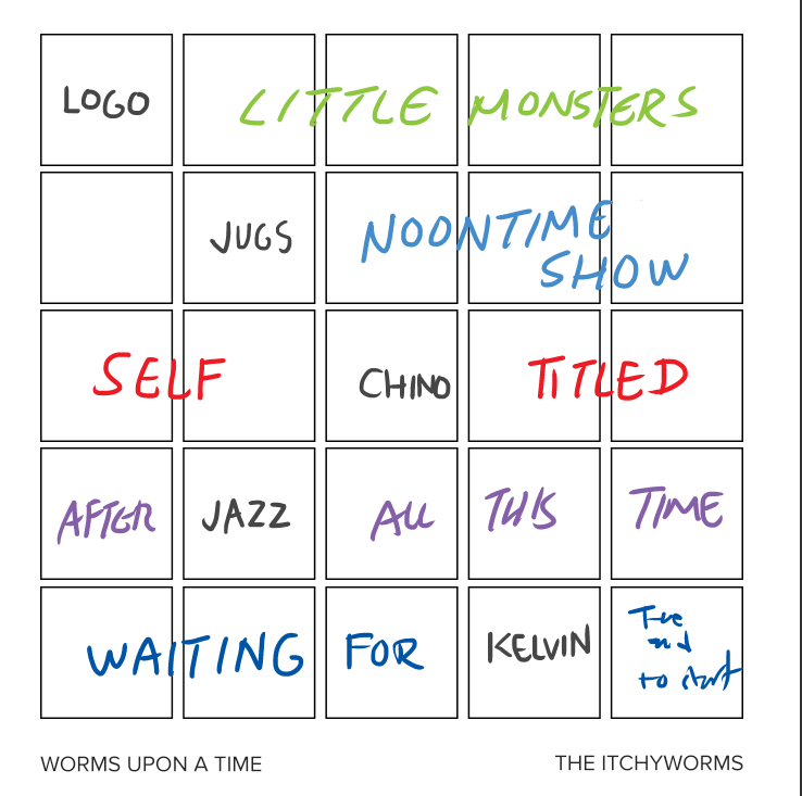
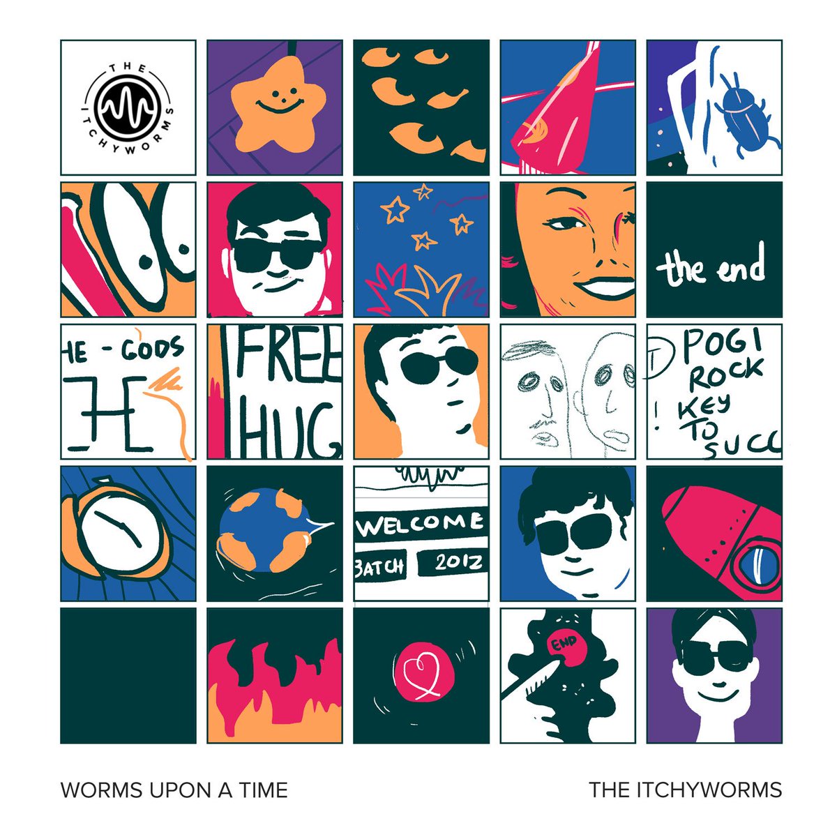
    how we got to the cover was i kinda segmented it as a grid, one row for each album, and each would have been snippets of album art, a song reference, a music video. they kinda felt like stuff was unrecognizable so we went for a more sticker-like approach
    how we got to the cover was i kinda segmented it as a grid, one row for each album, and each would have been snippets of album art, a song reference, a music video. they kinda felt like stuff was unrecognizable so we went for a more sticker-like approach
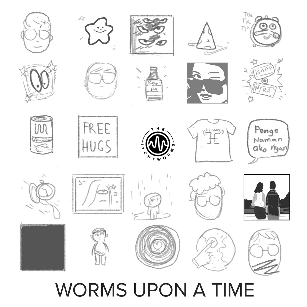
    how we got to the cover was i kinda segmented it as a grid, one row for each album, and each would have been snippets of album art, a song reference, a music video. they kinda felt like stuff was unrecognizable so we went for a more sticker-like approach
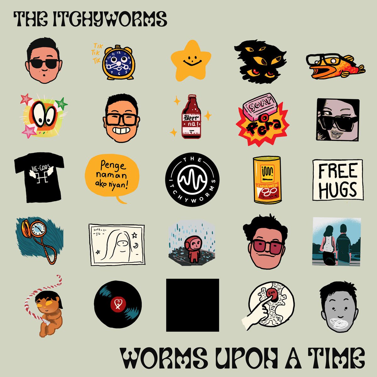
    how we got to the cover was i kinda segmented it as a grid, one row for each album, and each would have been snippets of album art, a song reference, a music video. they kinda felt like stuff was unrecognizable so we went for a more sticker-like approach
    how we got to the cover was i kinda segmented it as a grid, one row for each album, and each would have been snippets of album art, a song reference, a music video. they kinda felt like stuff was unrecognizable so we went for a more sticker-like approach
    1193年前
Loading...