Having simple, reusable bg palettes is a huge help taking out some coloring guesswork. Weekly comics are brutal to produce to anything that can help streamline is important. Also mapping settings and figuring out visual direction is SUPER important for explaining action


More bg refs from Street View. Some of these are much closer to the ref images I used but there's still a lot of adjustment to get the visual information to work with the layout of the super narrow but tall resolution of a digital scroll comic


Last page of concepts for Yuna & Kawachan. These were some rough color guides I made for my friend @samikerwin who helped with flat colors in the last few eps. The bottom left was me asking my editor how the final panel should look so it really makes me smile looking at it

Oh the triumphs and defeats, the epic highs and lows of drawing with imposter syndrome


作者のその他の人気の漫画

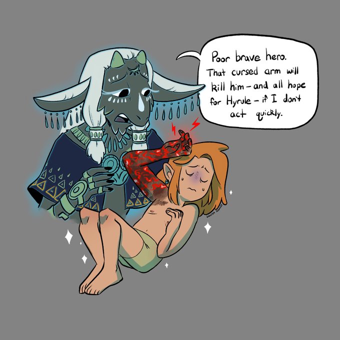
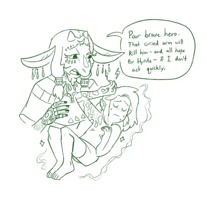
The joke might be dead at this point but here's Tears of the Kingdom: Wiggle to Detach (colorized)

MILD SPOILERS for the very beginning of Tears of the Kingdom. I've been cracking myself up thinking about Link's new arm and how Rauru attached it

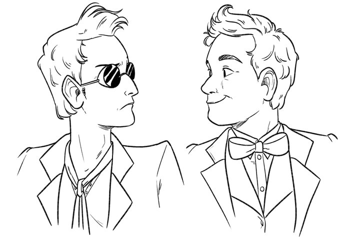
I finally watched Good Omens and yeah okay Crowley and Aziraphale are pretty fun

Visual representation that art and design can change over time. When I started Yuna & Kawachan, I tried to get my idea out quickly but the design has refined over the years. Junichiro and Kawachan are in a tie for best glow up: thank god I learned to draw them eventually

Dusty the silent cat witch

All the cool kids are doing it also go read Yuna & Kawachan :3c

Hey wanna see the steps I use to make my comic? I've done a lot to figure a balance of simplicity and challenge in the style used in Yuna & Kawachan. Every comic/production will differ in its approach. Also some Episode 37 panel previews! (Spoilers if you're not up to Ep35)

Yuna a few years later


