@RachelGillo eg: when I look at an artstation website on a phone, I can immediately see 6 images thumbnails and choose which one I want to click on vs seeing perhaps 1.5 images fullscreen which may or may not engage me. Again tho this is just my personal opinion. Maybe ask around.

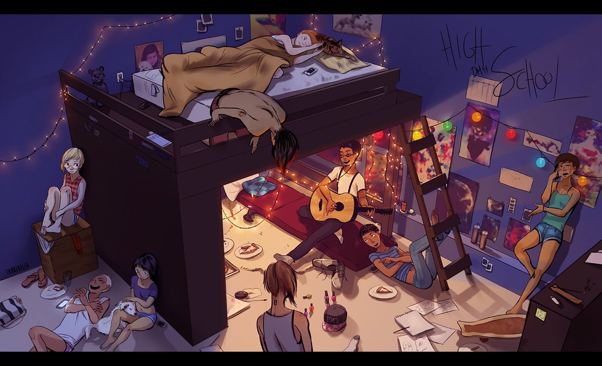
For some context, here's work from my senior year of High School. I had strengths in a lot of areas art school was focused on, and weaknesses in a lot of areas that very targeted online classes were perfect for. This is partially why I went the direction I did.

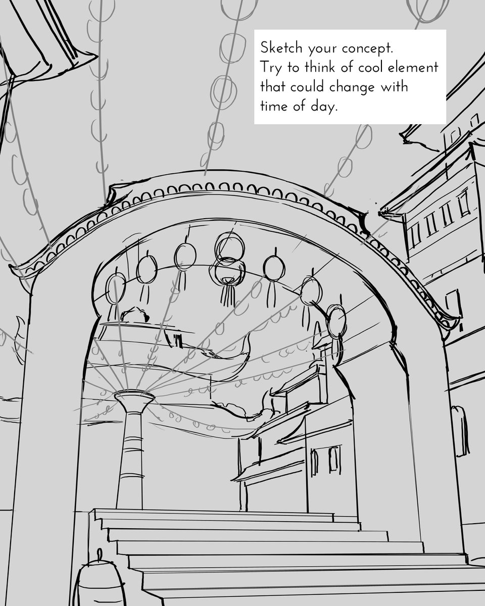
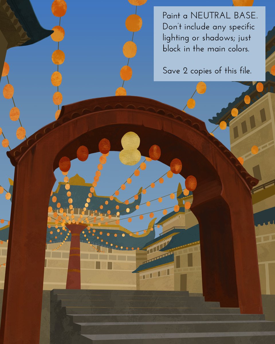
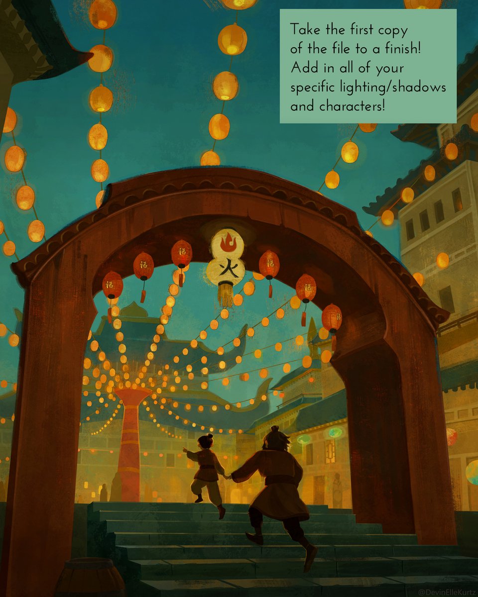
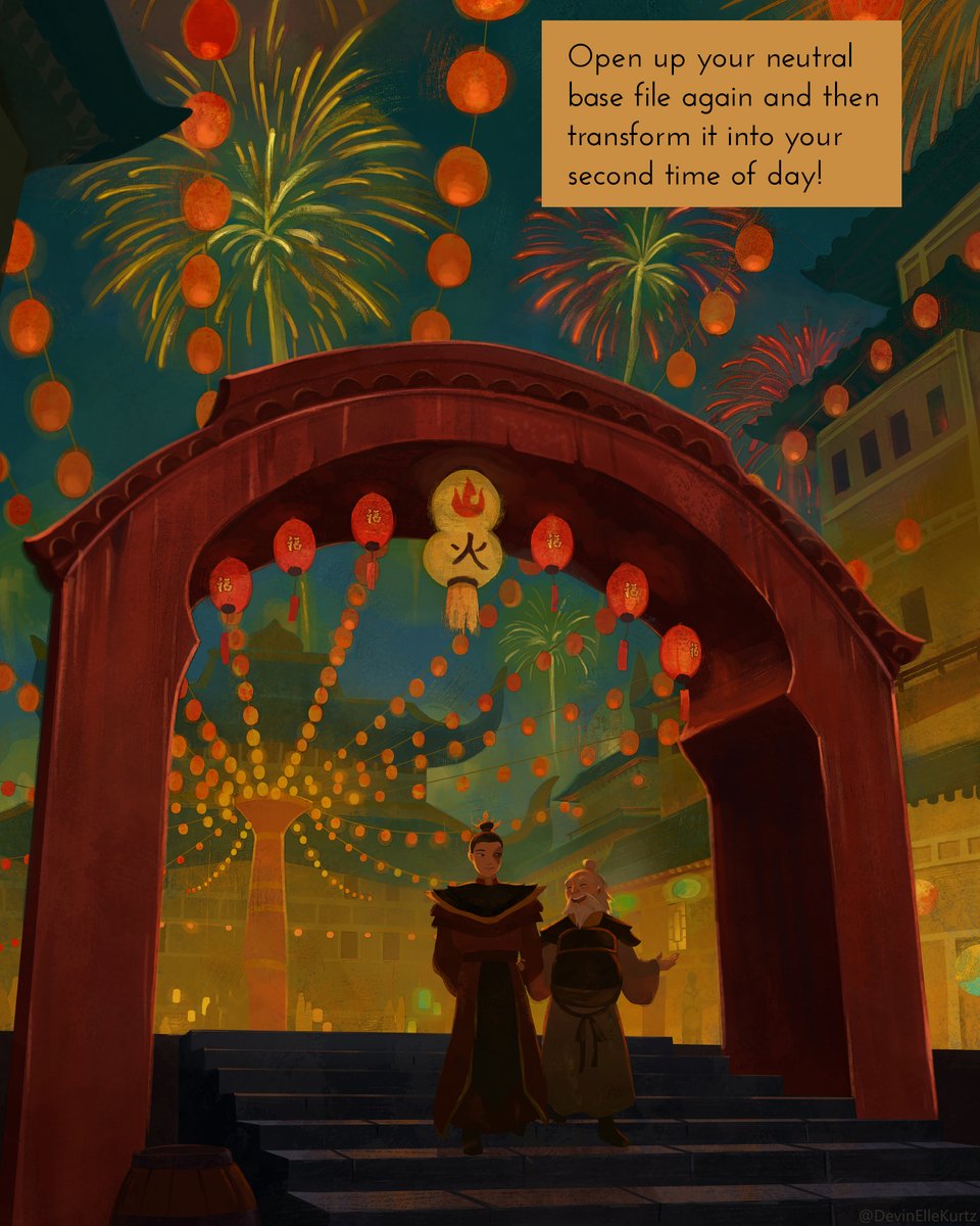
Extremely basic tutorial for how I create these dual images. It's all about creating a very neutral base for yourself that has occlusion shadows and basic textures but no real light or shadow elements. I'm going to thread a couple other examples of my neutral bases.
作者のその他の人気の漫画

Happy plant kids ??

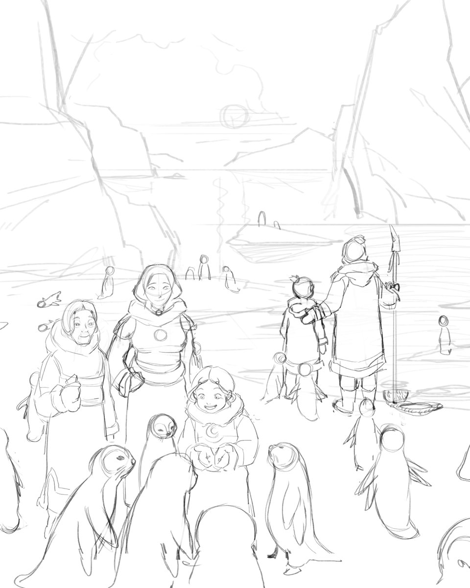
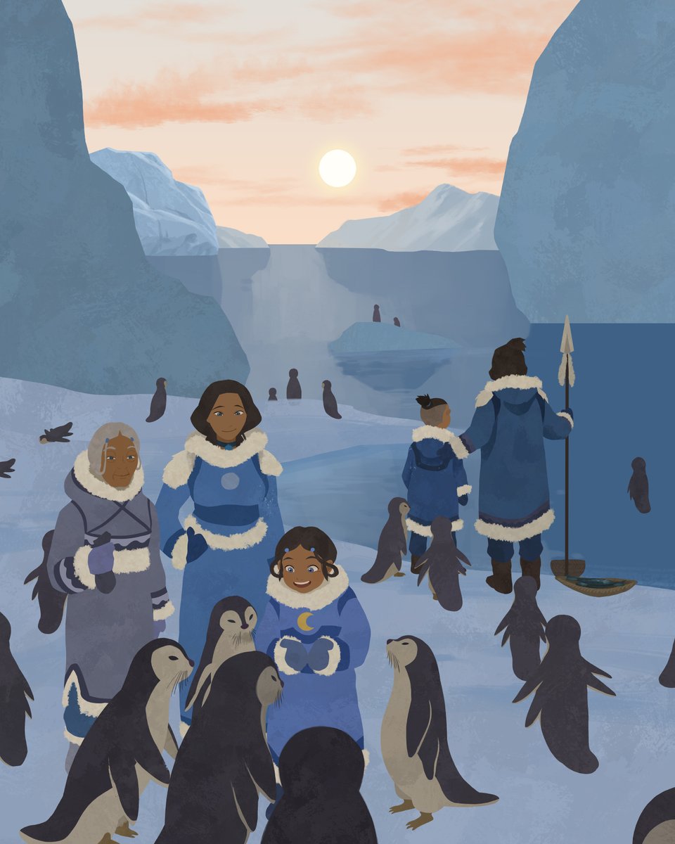
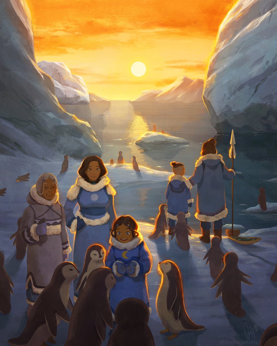
Process of "Katara's Childhood"

Painting architectural facades flat and then transforming them into perspective!! Huge time saver for rough design work! Here's a very quick tutorial on what I mean: https://t.co/DAjpEBe3iQ

Sketch ➡️ Final

Extremely basic tutorial for how I create these dual images. It's all about creating a very neutral base for yourself that has occlusion shadows and basic textures but no real light or shadow elements. I'm going to thread a couple other examples of my neutral bases.

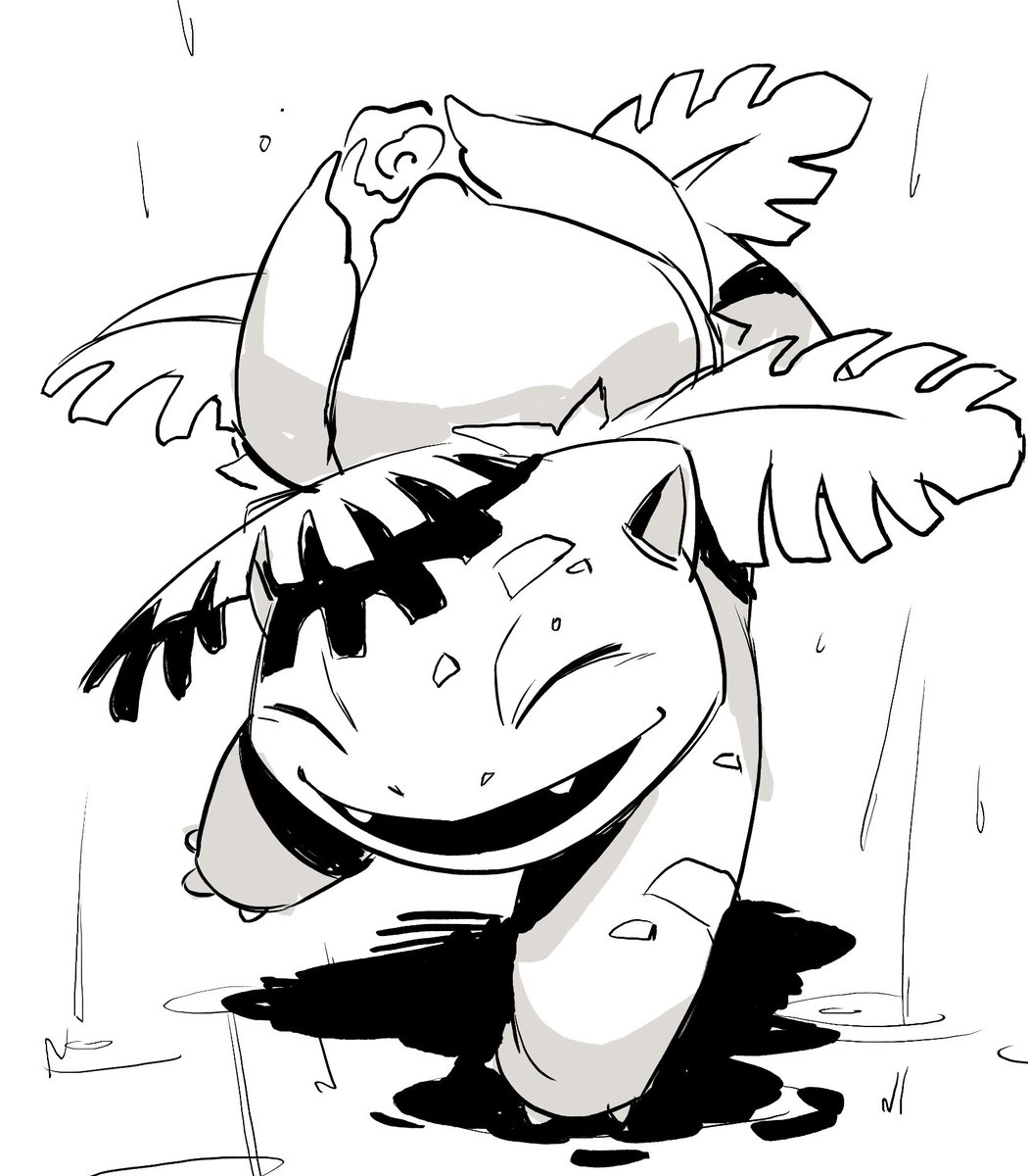
Evolving first has its benefits ☔

Because #Inktober is fast approaching, I'm going to take some time today to share my favorite techniques and practices I learned during 2018's Inktober in preparation for 2019 Inktober! - 1/?

Tiger sketch from a lil while back that Im still really fond of ?
